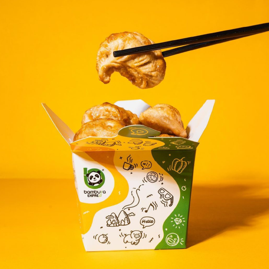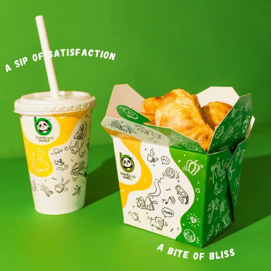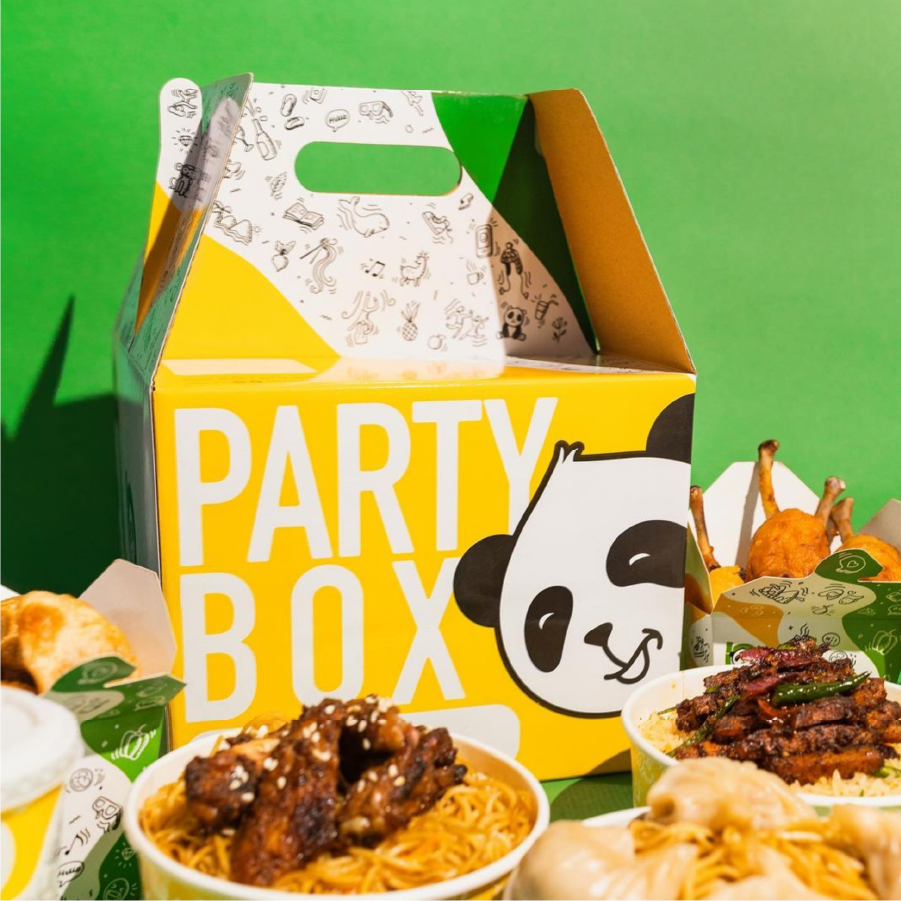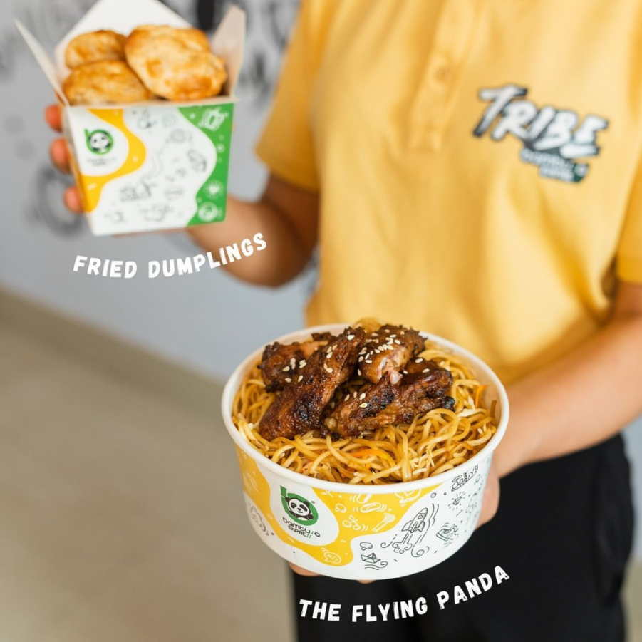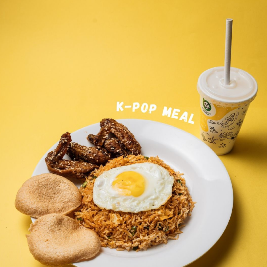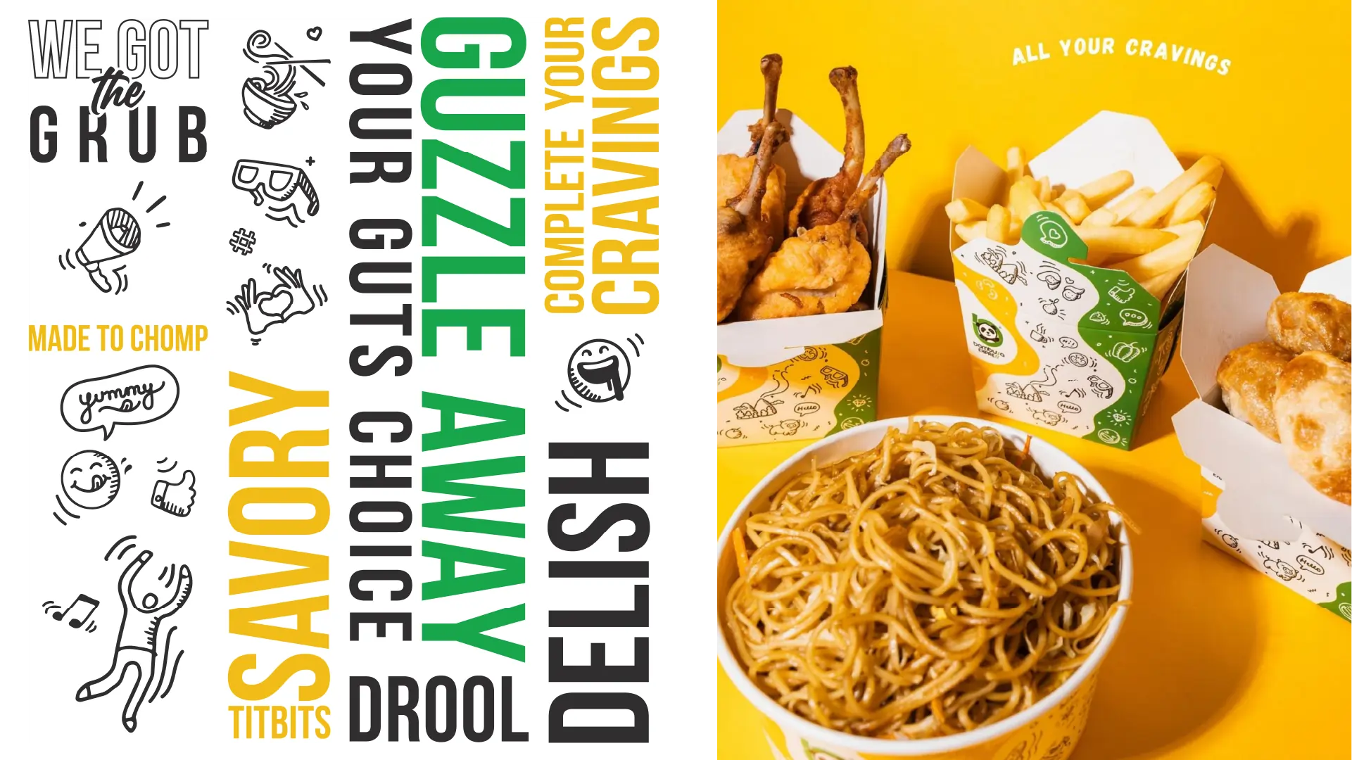
Check out the awesome brand transformation we did for Bambusa Express, Nagaland’s very first fast-food chain! We went all out with a vibrant colour scheme of yellow, green, and black, and added playful caricatures and doodle-inspired elements to create an atmosphere of pure fun and happiness. We wanted to make sure that Bambusa Express would appeal to everyone, so we crafted a one-of-a-kind brand experience that would really stand out. The logo got a major upgrade, featuring an adorable panda intertwined with bamboo to form the letter ‘b’. We even incorporated fun doodles into the packaging design to make sure that the brand would really stick in people’s minds. And to take it a step further, we also came up with food-related slang and adjectives for all the interior branding and communication materials in every outlet. The result? A super lively, unforgettable brand that truly embodies the joy of good times and great food.
